Glegoo Font
Designed by Eduardo Tunni
Preview
The quick brown fox jumps over the lazy dog
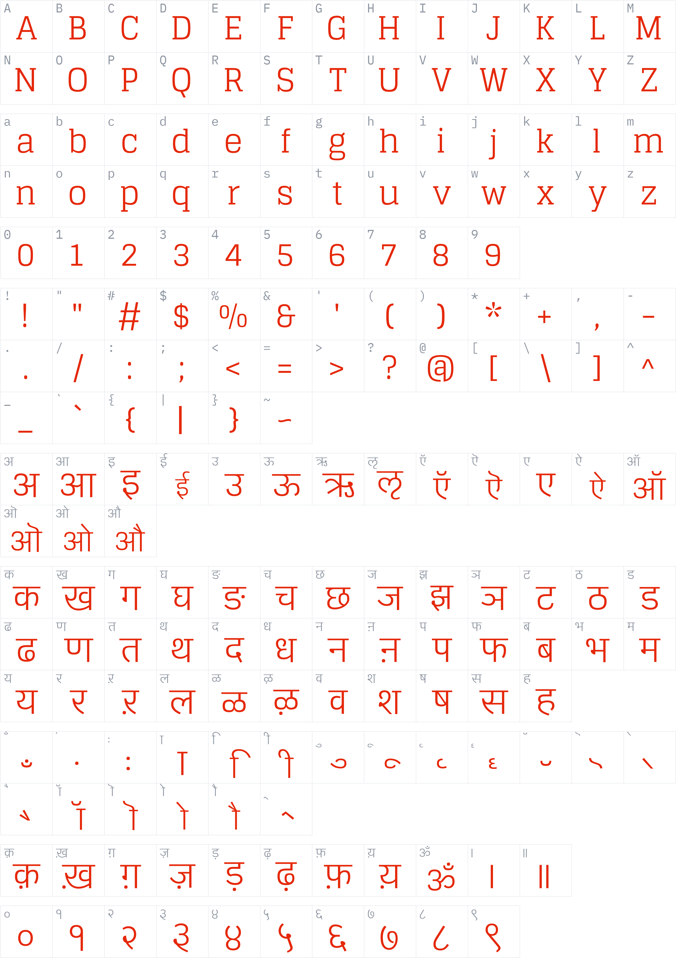
Character set
Styles and files
-
Regular
Weight 400 TTF265 KBThe quick brown fox jumps over the lazy dog
-
Bold
Weight 700 TTF264.7 KBThe quick brown fox jumps over the lazy dog
About Glegoo
Glegoo is a serif typeface designed by Eduardo Tunni, added to the Google Fonts library in 2012. It is distributed under the SIL Open Font License 1.1, and the license text is stored with the font and included in the download.
This family includes 2 styles (Regular, Bold).
Detected from the font files, it supports Devanagari, Latin text, with 862 glyphs in its largest file. Type your own text in the preview above to see how it looks before you download.
License
Commercial use allowed under SIL Open Font License 1.1
SIL Open Font License 1.1 · Official license text
Free to use, including commercially, study, modify and redistribute. The fonts may not be sold on their own and reserved font names must not be reused for modified versions.
Read the original license file (OFL.txt)
Copyright notice
Copyright (c) 2011, Eduardo Tunni (http://www.tipo.net.ar), Copyright 2011-13 Lohit Fonts Project contributors (http://fedorahosted.org/lohit)
This is a summary, not legal advice. Always read the full license before using a font commercially. See the font licensing guide.
How to install Glegoo
- Download the font family (ZIP) and extract it.
- Windows: right-click the
.ttfor.otffile and choose Install. macOS: double-click the file and choose Install Font. - Restart your design or office program, then pick Glegoo from the font list.
Need more detail? Read the full installation guide.
More fonts by Eduardo Tunni
Fonts that pair well with Glegoo
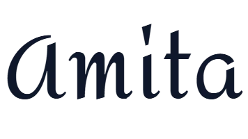
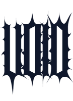
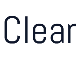
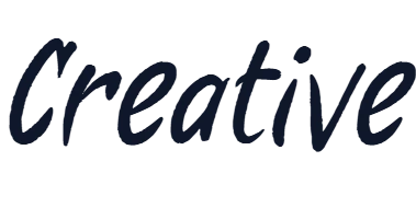
Good design mixes two or three fonts. These are picked from a different style (a clean sans next to a script, a serif next to a sans) so they stay easy to tell apart and cover the same language.
Similar fonts
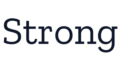
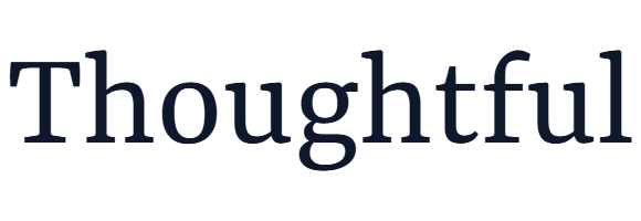
Yrsa
by Rosetta, Anna Giedryś, David Březina · Free Serif Fonts
4 styles WOFF2TTF Commercial use OK 5 downloads
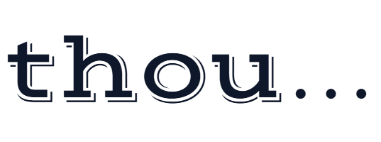
Zilla Slab Highlight
by Typotheque · Free Serif Fonts
4 styles WOFF2TTF Commercial use OK 2 downloads
Your Glegoo download has started
Check your Downloads folder. How to install it.